Setting a festival in one typeface.
Northline had 140 venues and one week of type decisions. Notes on choosing a single family that works on a sign, a poster and a phone.
Corinne Tate
Northline had 140 venues and one week of type decisions. Notes on choosing a single family that works on a sign, a poster and a phone.
Corinne Tate
When a festival runs across a whole city, type is the thing people see before they see anything else. For Northline we chose one family and gave it three jobs.
Signs are read from across the street, often at night. We needed open shapes, clear numerals and a bold weight that would not fill in on a printed vinyl.
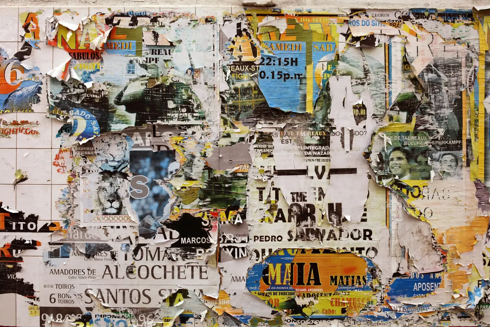
Posters are where the festival gets loud. The same family, set tight and large, carried the headline while venues filled in their own photos underneath.
The schedule lived on phones. A regular weight at sixteen pixels had to stay readable on a cracked screen in daylight.
One family, three sizes, no exceptions. The constraint made the festival look like one event.
Design director
Corinne leads type and layout across the studio. Before Apogee she designed books for two university presses.
A weekly review is the one meeting every project keeps. Here is how we run it, and why it is on a Friday.
What goes into the motion kits we hand over, and how a two-person marketing team uses one to cut a week of posts in an afternoon.